Back to selected work
UXLENS • AI
Creating an AI audit tool.

ROLE
Creator
METHOD
Claude, Figma, Github
OUTCOME
Working site
Context & Problem
Context & Problem
Creating a single manual WCAG audit took almost two weeks. This had me raking through multiple resources surrounding Section 508 and WCAG, and taking notes by hand. This arduous process took two weeks; time that could have been used for testing, iterating, and launching.
UX and accessibility audits can be resource-heavy and time-consuming, resulting in teams putting the process on hold and losing potential users.
What I wanted was to build something that would make audits more efficient.
Begin audit
Begin testing
Start research
(WCAG, Section 508)
Organize research
Split into design
& development
Debrief findings
with the team
Finalise in-house
guidelines
Apply findings
= 2 weeks
Without UXLens
Run UXlens
Begin testing
Apply findings
= 40 seconds
With UXLens
Decisions
Process
It took me 4 steps to create UXLens, starting from ideation, design, and code, to a working tool that real people could use.
01
Framing the rubric
I defined 6 audit dimensions so the output was structured and defensible, not just a vague AI result.
02
Design in Figma
I built the component system with tokens, components, and auto-layout before even getting to a line of code.
03
Figma -> Code
I used a Figma MCP connection to translate my components into the build, while keeping design and code in sync.
04
Test with real users
I put the tool in front of 3 testers from different professional fields for feedback; none of them designers.
Heuristic, visual, prioritised
What to change in the design, why it fails, and why it matters to the user.
Specific, technical, actionable
Output surfaces all findings for code-level fixes. ARIA labels, roles, and more.
01
Framing the rubric
I defined 6 audit dimensions so the output was structured and defensible, not just a vague AI result.
02
Design in Figma
I built the component system with tokens, components, and auto-layout before even getting to a line of code.
03
Figma -> Code
I used a Figma MCP connection to translate my components into the build, while keeping design and code in sync.
04
Test with real users
I put the tool in front of 3 testers from different professional fields for feedback; none of them designers.
Heuristic, visual, prioritised
What to change in the design, why it fails, and why it matters to the user.
Specific, technical, actionable
Code-level fixes: ARIA labels, roles, exact CSS, WCAG references.
The Criteria
Once I'd audited, calculated, and created the elevation system, I need to create a visual that communicated what levels to use on which component.
By following my guide, uniform usage across ITHAKA was guaranteed to be implemented.
CREATING
Designs
From the home screen to a scored, fixable audit in both the designer and developer views.
The loading logic
A spinning wheel with no feedback for 20 seconds reads as broken, even when it isn't — and each backend step actually varies in speed, so users had no way to gauge progress. Surfacing the real steps as they happen (reading the interface, scoring dimensions, writing callouts) turns an unpredictable wait into visible progress, without faking anything
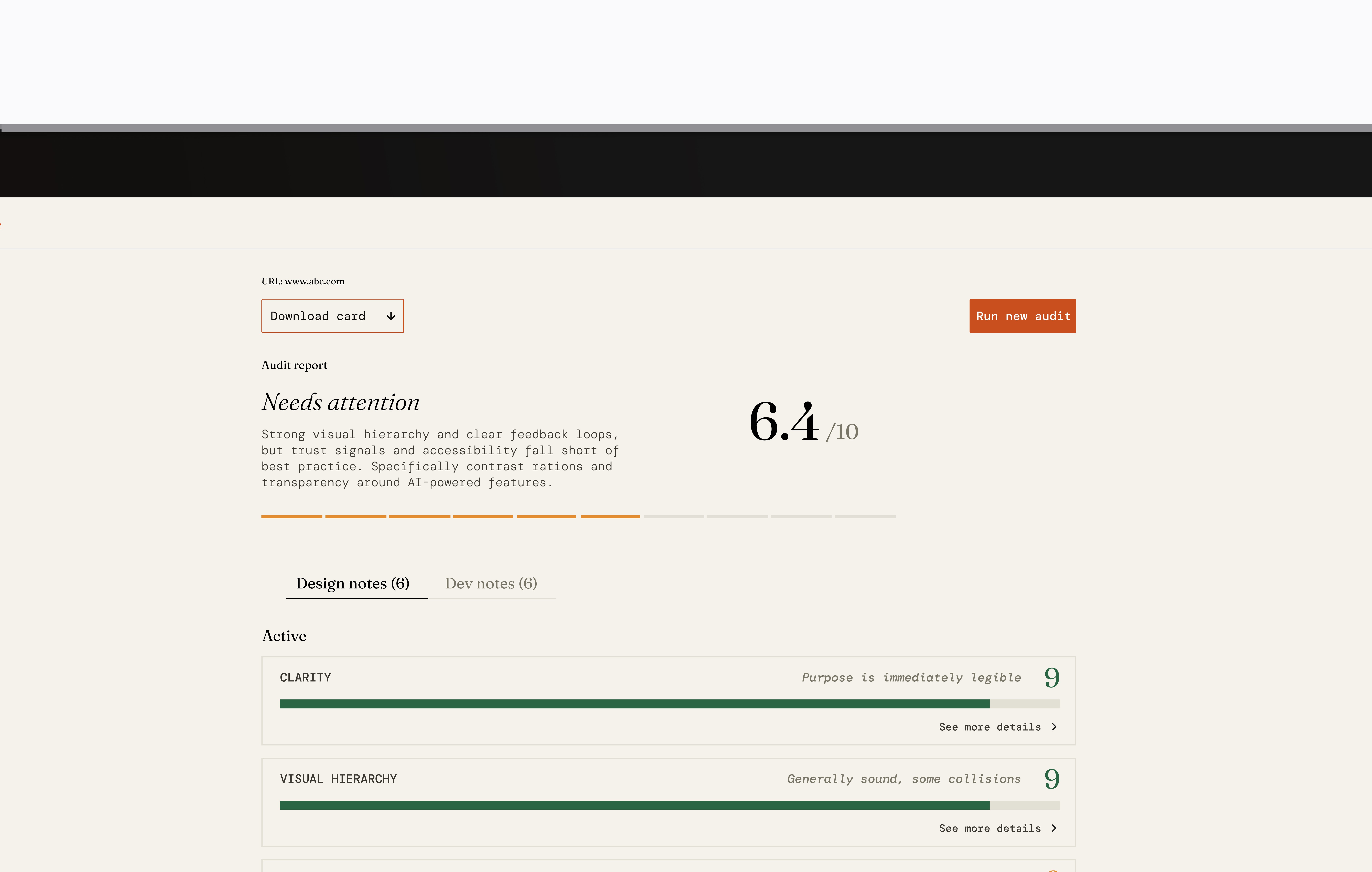
The overall info
An overall score and plain-language verdict up top, then six UX dimensions scored individually so users know exactly where they stand — not just that something's "off." Reports download so findings don't die in a browser tab; they land in whatever channel the team already works in.
Task tracking
Each dimension's expanded card comes with ready-to-act tasks, not just a critique — checkbox included. Checking one off moves it straight to Resolved, so the audit doubles as a running to-do list instead of a static report you'd have to transcribe elsewhere.
Design vs. Dev notes
The same issue means different things to different people. Design notes translate it into visual and interaction changes; Dev notes hand engineers the exact implementation — ARIA attributes, WCAG references — ready to act on without a translation step in between.
RESULTS
Impact
2 weeks to 40 seconds
Audit time collapsed. The same rigour, delivered in the time it takes to make coffee.
6 dimensions
A structured rubric that maps 1:1 with development. It flags the issue and explains it, so teams learn the pattern.
2 reports
Designer and developer each get their own, from one run.
Entered into an AI for Good competition with a tiered model — free for nonprofits, paid for agencies.
User feedback
Though a passion project, I wanted to speak to different types of users. Is it straightforward enough for those outside of tech to understand? How is the tool valuable to different audiences? The tool is based on personal observations, personal pain points, and assumptions, so I wanted to investigate how other professionals would interact with it.
ROBERTO · specialist at a major telecommunications company
"I think this tool would have helped us a lot. One thing I'd find valuable would be a way to see if some things are on some page and not other pages. For the tool to pick it out."
JUDY · healthcare platform user
I always felt navigating [this] medical platform very frustrating. I can use this tool to find out what the issues are and share this with the medical practice.
MARY · founder of a wellness company
At my wellness retreat, we audited our User Experience and User Interface with Jo's AI program and got a score that outlined areas of improvement. We are initially focusing on the pricing model not being clear and working our way down the list. A truly remarkable tool.
What's next?
Two next steps came out of the user conversations.
Want to talk more? Contact me!