Back to selected work
RISEKIT • UX DESIGN
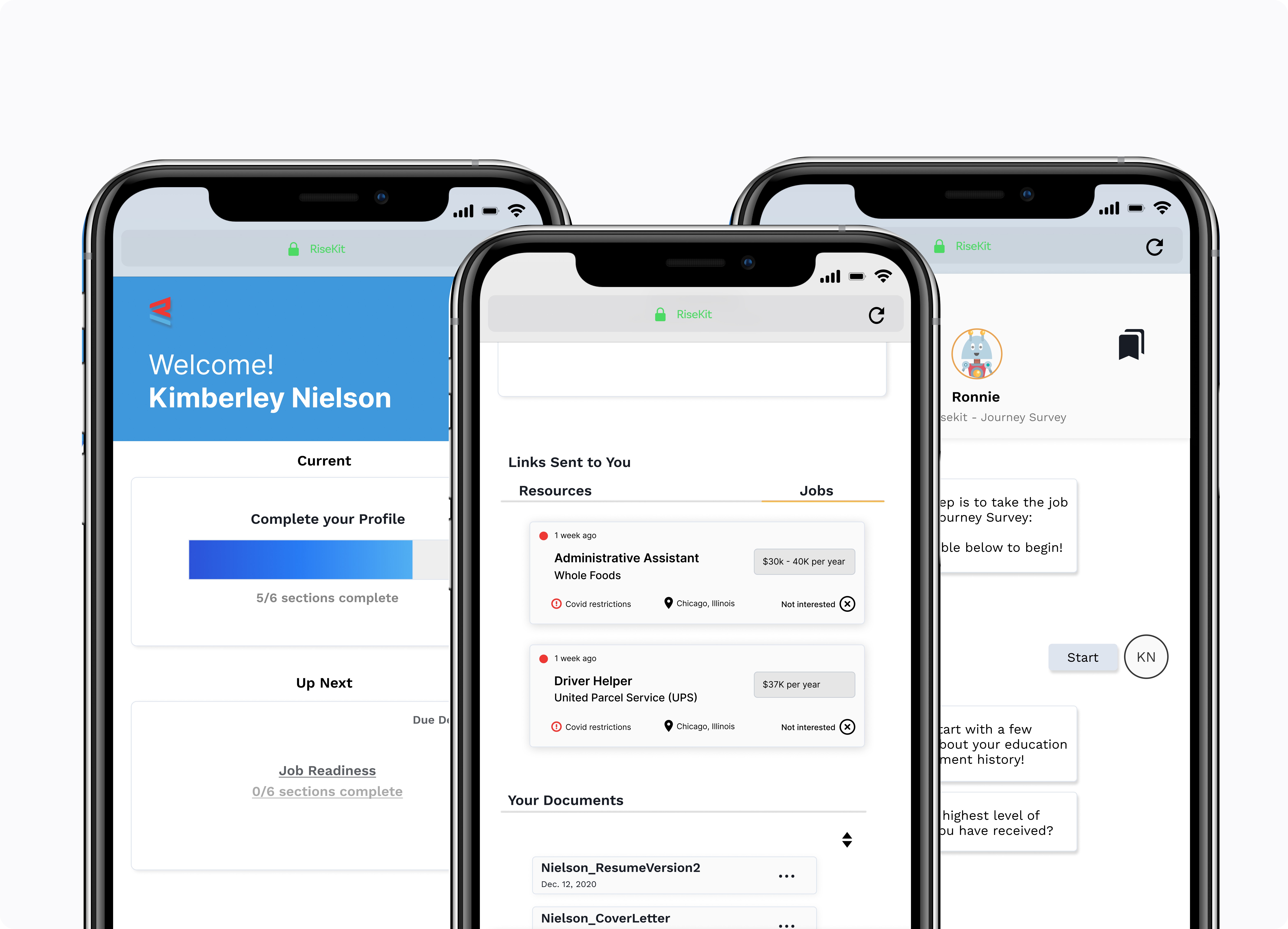
TIMELINE
2 years
ROLE
Lead UX Designer
TEAM
Engineers
TL;DR
RiseKit is a company that helps underrepresented people find jobs by connecting them with resources, events, and training. The primary way to access customers was through external partnerships using an inclusive mobile experience. With this redesign, I led the V1 end-to-end design, focused on building clearer flows and improving usability, while creating an in-house accessibility and usability documents.
33%
user retention
3.3%
increase from a 1.78% click through rate
2 new enterprise clients
increased focus on accessibility allowed broader audience
50%
new users completed onboarding
Overview
RiseKit is a company that partners with non-profits organizations to prove under-served communities equal access to jobs.
People are brought on to RiseKit’s platform through partnerships and are guided through the process of finding a job or resource.
What we needed was a mobile app that guides jobseekers in their process of landing employment.

PROBLEMS & CHALLENGES
High drop-out rates
Operational costs are rising due to heavy reliance on support calls. These are numbers from a company in Chicago that I had to redact.
83.7% drop-out rate
233
enrolled
34
applied
Accepted into Program
Apply to Program
Conversation with Nonprofit Staff
Current Employment
Desired Skills
Drug Test
Education Level
Household Count
How did you hear about us?
Intro Confidence Check-in
Job Applications
Job Links
Last Employer
Program Completed
Proof of Employment
Resume Upload
Total drop-out
4
2
6
1
1
2
127
2
3
21
1
2
2
3
10
12
199
Mistrust & external variables
Operational costs are rising due to heavy reliance on support calls. These are numbers from a company in Chicago that I had to redact.
It is very difficult to engage and build trust with candidates who have not heard from RiseKit in a very long time — we need reminders / consistent communication with candidates.
The silence between touchpoints is where candidates disengaged
Many RiseKit candidates also “fell off” after the first 3–5 questions of the journey intake survey.
Candidates had no drive to continue with account set up
"I learned the more meaningful interactions I have with candidates (one-on-one coaching), the more transparent and trusting they are — allowing me to better serve them by providing resources that are best suited to suit their needs."
Candidates did not have enough trust with the platform, meaning we needed stronger contact methods
Fixes needed often
Fixes result in the platform needing to double back and fix UX issues so that users could use Risekit's potential fully. Double-backs wasted time and effort
Click-through rate (Q3)
Marketing emails to Risekit
1.78%
2.5%
3.8%
Goal
Now
Great
Accessibility & Interface checklist
Standards I wrote along the way
Nobody asked for this work.
For me, the perfect time to understand accessibility constraints is before building the product. We save production time, also with a product that was already in danger from large bounceback rates, we couldn't affored to not be able to cater to those users who go through the Risekit platform. If it were breaking, it wouldn't retain users. by reducing the iteration
design
build
QA
launch
sell
Cost & efficiency
Cheaper to design right, than to redesign later!
Reduces tech debt by building reusable accessible patterns
Avoids rework across eng, QA, design
Design quality
Forces clarity early, surfacing edge cases
Benefits all users
Team & process
Incremental testing instead of one huge audit at the end
Risk & compliance
Reduces legal exposure from Section 508 complaints
Avoids panic building when a product has already shipped
Business & brand
Appx 16% of people in the world have a disability
Expands market reach
Supports SEO
My in-house accessibility guide
I wrote this for the whole team: developers and designers. Contrast guidelines, AA thresholds, text and graphical objects, and pass/fail examples to copy from.
My usability checklist
I created a UI checklist for ideation, hierarchy, spacing, typography, color, and interaction states, so that accessibility is verified at every step rather than retrofitted at the end.
Design needs
Auditing the platform
ITHAKA has a wide variety of platform offering different services to different user bases: Students, librarians, researchers, and more, meaning we have to cater to those groups; aspects will inevitably be different. However, one thing that shouldn't change is our design system. Being siloed can result in discrepancies and the more our individual platform use cases expand, the more our needs split.
System creation
Colors and semantics
Colors had been defined as standalone values rather than part of a system, which made it difficult to scale and apply consistently across the product. Without defined roles or tokens, designers and engineers had to make judgment calls, leading to inconsistencies in the UI.
So, instead of defining colors by appearance alone, I mapped them to clear semantic roles. I created primary actions, feedback states, text, and backgrounds. This made the system more intuitive and easier to apply across different context.
I also documented the WCAG rating of every color, so that different use cases were considered (is color-black better than color-white when considering this color?)
Components
The old component library held a few reusable elements, but the library was small. Inputs, buttons and other UI components were treated as one-off designs rather than part of a cohesive system.
Due to having to redesign the experience, I believed it was the best time to finally build a system-driven foundation, where every component was standardized with a clear structure and defined states. Due to rapid relaunch, I filled the library with “must-haves”.
(See how I would've incorporated AI if I had access to it back then! They’re live further down…)


Icons
There were only a handful of icons available that followed UI guidelines. All other icons on the platform were gathered from resources that were quickly accessible, rather than built in-house for a consistent feel.
The new icon library supports a wider range of user actions and states, each with a specific purpose and usage guidance. This allowed me to reduce any ambiguity, and make interfaces easier to implement and ship.
The new library icons are also created on a 44px by 44px grid hotspot, complying with accessibility guidelines.

Typography and roles
As shown earlier, Risekit’s typography system went unused. Different fonts and weights were used together, causing misalignment and inconsistent line heights.
The hierarchy across sections was thrown off, and associating headers with sections became difficult to follow.
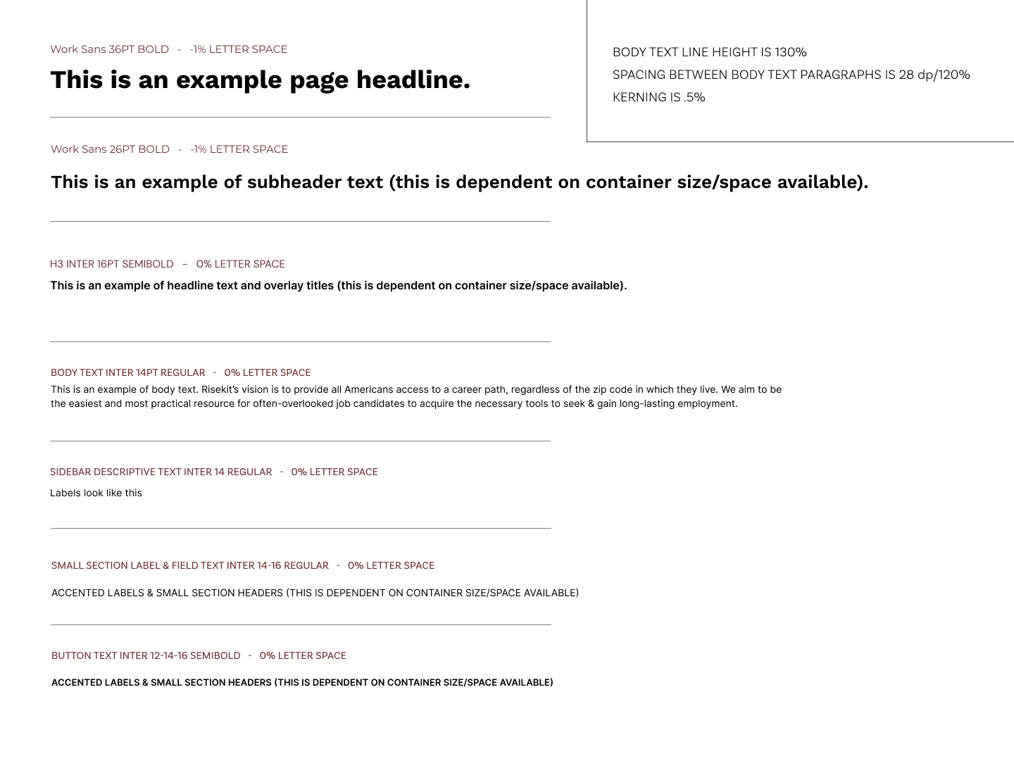
The new scale that I created defined roles (headlines, subheaders, body, labels, buttons) with sizes, weights, body line-height, dp, and letter spacing, giving designers and engineers clear guidance on how text behaves in every component. Selected were: Work Sans and Inter.
Motion
RiseKit's original interactions were static and sudden — screens just appeared, with no sense of continuity between states. I wanted motion that felt intentional without slowing anyone down.
That meant answering three questions: Should one motion carry the whole experience, or does it vary by context? If it varies, what's the reasoning? And how do we actually land on the curve itself?
Most users don't want to sit through a slow ease-in or ease-in-and-out — they want to finish the task, not wait for the animation to catch up. So I built a custom Bézier curve: fast enough to feel responsive, smooth enough to feel considered. It's the curve behind every interaction detail in the file, and it's what drives the drawers and sliding pages you see on the Home page to the right.

Preliminary research
Competitive analysis
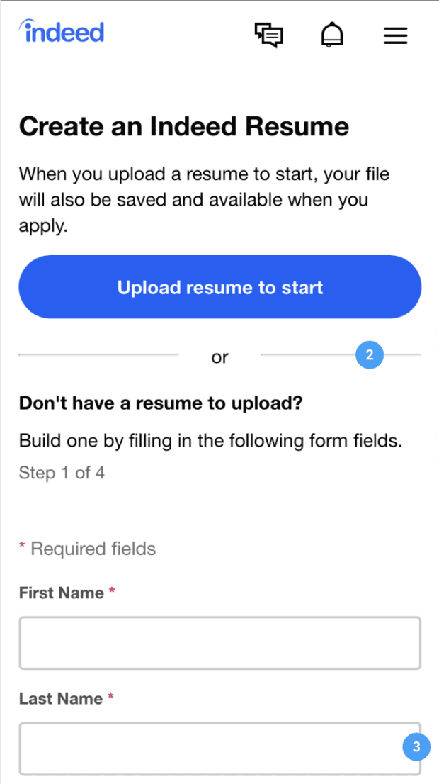
We walked the mobile job-seeking flows of Indeed and Snagajob end to end, from first screen to first application. Both are built for someone who already has a résumé and the vocabulary to describe their work. Six patterns shaped what we designed next.




You need a resume
The user has no choice but to establish a resume for their profile: if they choose not to upload an existing file, they're immediately ushered into the creation wizard, ensuring users are unable to browse listing or apply for a job without a resumé on file.
Boxes assume experience
The generalized description box with 2 list-formatting choices indicate that this service is not geared towards inexperienced job-seekers. It also does not provide guidance for the best way forward.
Unclear hierarchies
Field are marked as required, but are followed by a checkbox allowing them to skip the step. This creates confusion over the necessity and benefit of the information being asked of them.
Mixed signals
No information or suggestion is provided to the user as to what "additional information" they could be providing that is not covered in the other categories. It lengthens the form and creates confusion.
User progression
An incentive to complete the profile, this time offering the incentive of receiving more relevant job postings after the provide more personal information
Statistics over coaching
"Filling out 2 or more work experiences will double your chances" puts overwhelming pressure with a success figure, that a user may not have. It may highlight that they won't be successful without more than 1 job under their belt.
Persona

Her phone is her main job search tool
80% of her time is spend on her phone. Between her commute to work and home, Kimberly uses it to browse jobs and resources.
Barriers and guidance
Thought she has been promoted to shift lead, her employment history doesn't read as "professional". She is also unfamiliar with white-collar hiring etiquette, resulting in a need for guidance.
She values steps over decisions
With children at home and a part-time work schedule, Kimberly needs realistic, structured steps to reach her end goal: a full time job with benefits. She needs to avoid being overwhelmed.
Her time is filled
Long hours and unstable childcare makes Kimberly anxious about availability for interviews. She needs resources to support her current life so she can focus on her job search.
Outcome
Existing job-seeking tools struggle to care for first-time professionals like Kimberly
Building blocks
Sitemap
The sitemap was created to organize the content and hierarchy of the new application in a logical and user friendly way.

Wireframes
I created and tested wireframes prior to building out the high-fidelity screens. This helped me have realistic discussions around feasibility with the development team and point out any scope-creep with the product team.

Designs
Final designs
ITHAKA has a wide variety of platform offering different services to different user bases: Students, librarians, researchers, and more, meaning we have to cater to those groups; aspects will inevitably be different. However, one thing that shouldn't change is our design system. Being siloed can result in discrepancies and the more our individual platform use cases expand, the more our needs split.
Sign up
Invited users only need to verify what their organization already provided — no re-entering education, address, or employment info. That's a deliberate cut: the old flow asked for all of it upfront and lost 127 of 233 users at the education field alone. We moved anything non-essential into onboarding, after the user has a reason to trust the product, trading a complete profile at signup for a completed signup.
Chat
Instead of a form, onboarding continues through a scripted chat: education level, job-seeking status, certification — all multiple choice. Framing it as conversation rather than a form makes the same questions feel lighter, and the multiple-choice format keeps users moving forward one tap at a time instead of giving them a static field to abandon. It worked — 50% of new users completed onboarding, up from the drop-off we saw in the old form.
Bookmarks
Once the bot hands users off to a live career coach, RiseKit's own data showed something worth designing around: users open up more in one-on-one coaching, and that trust lets coaches match them to better resources. Bookmarks is the infrastructure for that — four tabs (Steps, Files, Links, Pinned) that auto-populate as the conversation happens, so a resume the user sends, a job link the coach shares, or a moment either side wants to revisit is never lost in scroll-back.
Four tabs handed to a user straight out of onboarding risked feeling like a dashboard, not a conversation, so each tab introduces itself with a single tooltip the first time it's opened rather than all at once.
Home
Toggle to see old design
With an 83.7% dropout rate across the broader job-search journey, the risk wasn't losing users at one screen — it was losing them to uncertainty about what to do next at any point. Homepage answers that directly: "Complete your Profile" and "Job Readiness" sit at the top with a progress bar, so the very next action is never a guess.
Everything the coaching relationship generates — sent links, uploaded documents — surfaces here too, rather than staying buried in Chat history a user would have to scroll back to find.
Pathway progress
Job search can feel like an indefinite process with no visible finish line, so Pathway Progress gives users a fixed structure to move through — a general overview showing which step they're on and what that step involves, so there's always a next milestone rather than an open-ended slog.
Status is communicated through explicit labels ("Active" vs. "Non-Active"), not color alone — a small but deliberate accessibility call, since color-only status indicators exclude users with red-green color blindness.
Profile
Sign Up deliberately deferred anything not essential to account creation — education, employment details, boundaries a user hadn't stated yet. Profile is where that information actually settles: basic info, job-seeking status, current situation, and settings, organized as expandable sections a user can open one at a time rather than a single long page.
Nothing here is locked to how it arrived — users can revise anything the system collected on their behalf during onboarding or coaching, so the profile stays accurate as their situation changes, not frozen at whatever they said in week one.
Outcome
Results
33%
log in more than once
40%
submit two or more applications
50%
complete the journey intake questionnaire
50%
finish their work experience

What I'd do differently & What I learned
Updated with AI
When building the new component library, I relied on our use cases and the platform's historical usage. This meant that I had the basics (default, secondary, hover, disabled), but they were all stuck in a Figma file along with their colors and states.
So, now that AI is being incorporated, speeding up parts of the design process that would otherwise take hours, I tried my hand at prompting. This is what happened.
Prompt: "I’ve created my hex codes (my tokens are color-primary [code], color-primary-hover [code], etc), foundational properties, and linked them to my VSCode terminal. Complete button components in CSS for any missing states or variants that I can open with Live Server."
Result:
Four fills on one artboard. Everything below came out of naming them.
Out of my 4 button components came:
3 variants
3 sizes
2 shapes
and an icon button family.
I'd be able to ship a demo, a live, working page to prove the states work, not just Figma artboards.
Work closely with developers
With RiseKit initially being a developer-built platform, it was helpful to work off a skeleton. The important tools were there, but the UX and the research behind the decisions was missing. I learned here that even if the idea is solid, the relationship between development and design is especially important in building good UX; not just the designer. This saved iteration time.
Touch base with stakeholders often
Keeping in touch with stakeholders helped keep the scope tight. I didn't drift into spaces that didn't need attention, or build unecessary tools. I was able to directly focus on the problems at hand, while being able to back my design decisions based on org needs.
What I learned
Collect qualitative feedback
What's next
Want to talk more? Contact me!