I wired Figma to Claude with MCP. The result audits any interface in 40 seconds.
Accepted to the Tech4Good 2026 competition.
Context & Problem.
UX and accessibility audits can be resource-heavy and time-consuming, resulting in teams putting the process on hold and losing potential users.
Creating a single manual WCAG audit and a guideline at a start-up (see my Risekit case) took almost two weeks. This had me raking through multiple resources surrounding Section 508 and WCAG, and taking notes by hand. This arduous process took two weeks, which could have been used to test, iterate, or even launch.
What I wanted was to build something that would make audits more efficient.
Without UXLens
Begin testing
With UXLens
Begin audit
Start research (WCAG, Section 508)
Organize research
Split research into development & design
Lead team meetings to debrief findings
Finalize & use as in-house guidelines
Apply findings
Run UXLens
Apply findings from report output
Begin testing
Process & Decisions
Four moves took UXLens from a idea to a working tool real people could use.
01
Frame the rubric
I defined 6 audit dimensions so the output was structured and defensible, not just a vague AI result.
02
Design in Figma
I built the component system with tokens, components, and auto-layout before even getting to a line of code.
03
Figma → code via MCP
I used a Figma MCP connection to translate my components into the build, while keeping design and code in sync.
04
Test with real users
I put the tool in front of 3 testers from different professional fields for feedback.
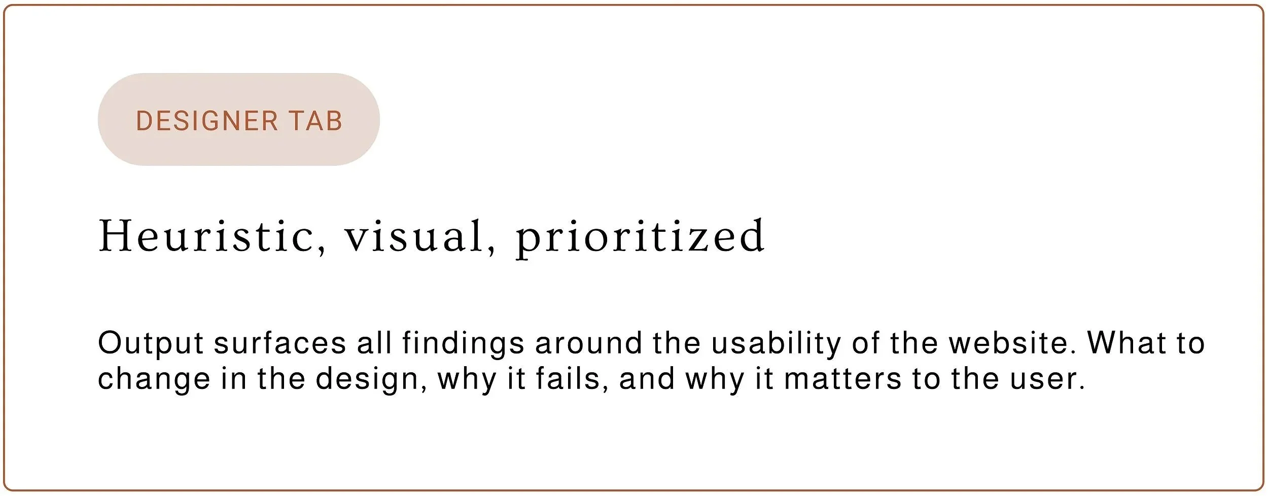
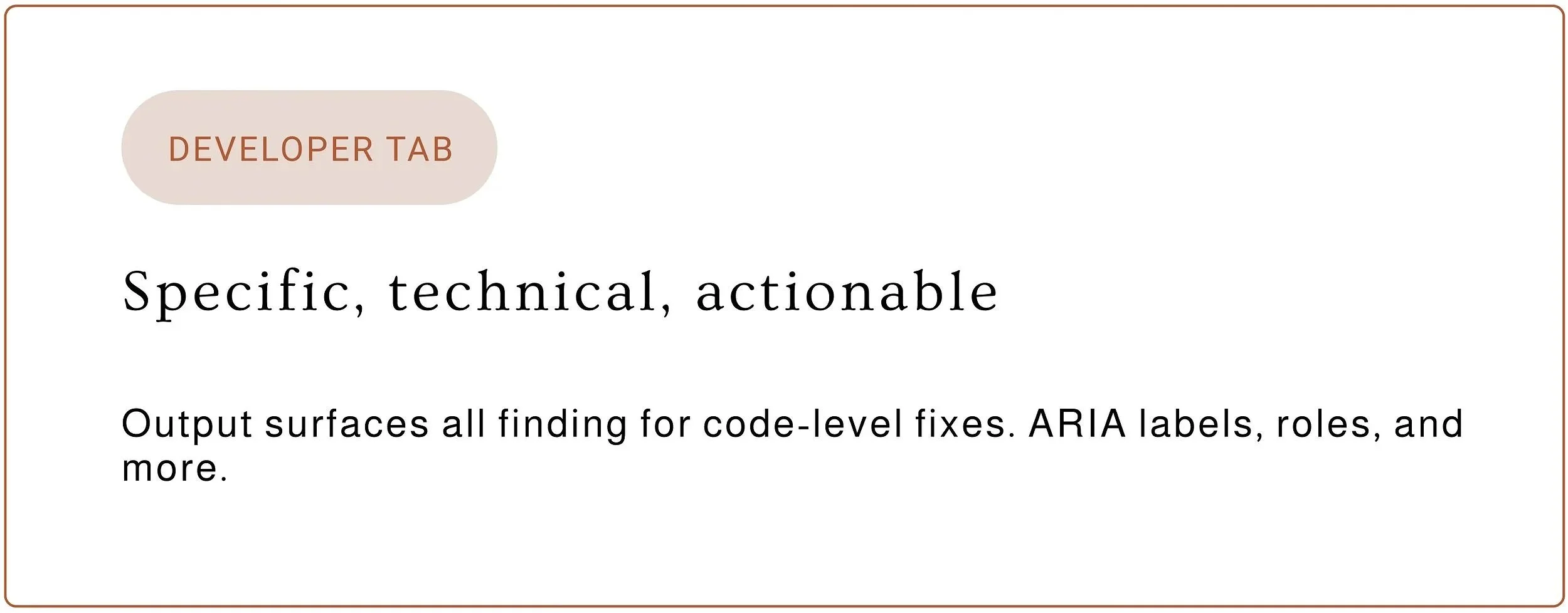
2 audiences, 1 audit
The Criteria
-
Clarity
Is the purpose of each screen immediately legible?
-

Visual Hierarchy
Does the eye land where it should once the page has loaded? Is it in the right order?
-
Trust Signals
Are credibility and security cues present where they matter?
-
Transparency
Does the interface tell users what's happening and why?
-
Accessibility
WCAG checks on contrast, focus order, and semantics.
-
Feedback Loops
Does the system confirm, guide, and recover gracefully?
Designs
From the home screen to a scored, fixable audit in both the designer and developer views.
(Please, click to view full images)
The entry point
Paste a URL or drag in a screenshot. Use your free Claude API key to start the audit.
The rubric and how it works
Read more about what I’ve defined for each of the dimensions.
The Rubric
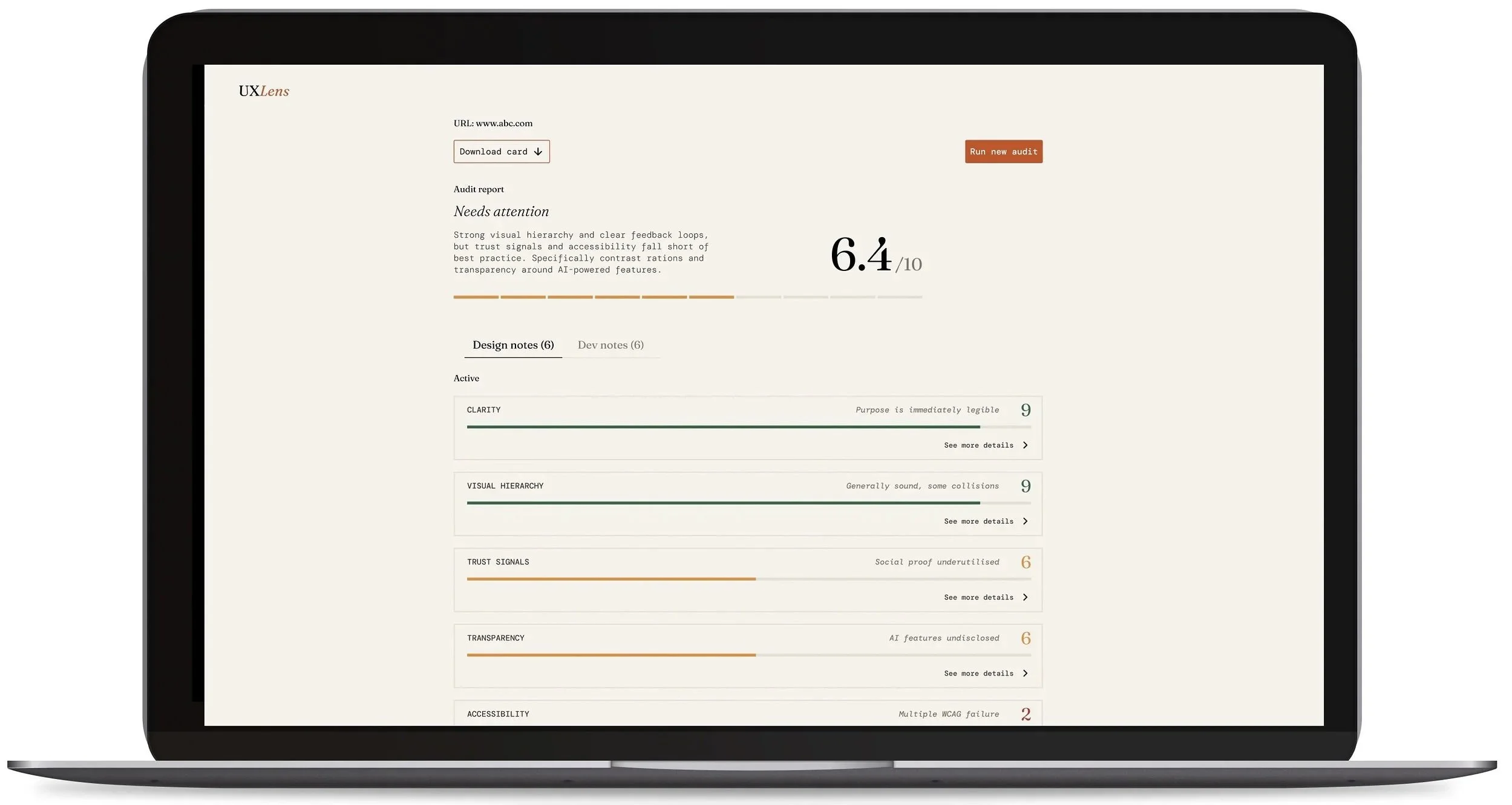
Once the audit is run, users are given an overall score, a ‘needs attention’ summary, and six UX dimensions, each with a score, a one-line verdict, and the ability to expand to ‘see more details’.
Users can toggle between Design notes and Dev notes.
Design notes
Users can expand the card to view a more in-depth list of flagged Design issues that need fixing. They can also mark a task as ‘done’. Only Development issues will show in the development section.
section.
Development notes
The same behavior as the Design notes. The only difference is that flagged issues will be those that can be fixed by adding them to the code.
Note: “Feedback” between Designer and Developer is different.
Impact
2 weeks → 40 secs
Audit time collapsed! The same rigor and quality delivered faster and more conveniently.
6 dimensions
A structured rubric that is 1:1 with development. It not only flags but also explains the issue, allowing teams to learn accessibility patterns along the way.
Entered into an AI for Good competition with a tiered model — free for nonprofits, paid for agencies.
2 reports
Designer and developer each get their own.
User feedback
Though a passion project, I wanted to speak to different types of users. Is it straightforward enough for those outside of tech to understand? How is the tool valuable to different audiences? The tool is based on personal observations, personal pain points, and assumptions, so I wanted to investigate how other professionals would interact with it.
"I think this tool would have helped us a lot. One thing I'd find valuable would be a way to see if some things are on some page and not other pages. For the tool to pick it out."
-Roberto, specialist at a major telecommunications company
"I always felt navigating [this] medical platform very frustrating. I can use this tool to find out what the issues are and share this with the medical practice."
-Judy, healthcare platform user
“At my wellness retreat, we audited our User Experience and User Interface with Jo's AI program and got a score that outlined areas of improvement. We are initially focusing on the pricing model not being clear and working our way down the list. A truly remarkable tool."
-Mary, founder of a wellness company
What’s next?
Based on user conversations, I parsed out 2 next steps that I want to further explore:
Expanding audit
As a specialist in Outreach, Roberto made the point that though the tool was helpful, he’d be interested in being able to customize the audit. As someone not on the tech or design side, he found that value for him would arise in making sure that every page across the site had a consistent feature, for example, a working chatbot. He was more interested in consistency than anything.
Expanding the scan
Through observation, I noticed the pain of putting each page’s URL into the “Run New Audit” function, slowing down the experience. The tool can surface issues in 40 seconds, but going page by page brings on its own issues. Being able to run the entire website may take longer, but it’s a trade-off.
Curious how your interface scores?
Try it out!